
At face value a movie poster is a means to sell a film to the audience with a single image. At a glance, the poster is supposed to intrigue, entice and captivate the potential viewer. Sometimes they do more. Sometimes the poster is so clever, so beautiful and so unique the poster itself becomes iconic and a stand-alone feature from the movie (think Jaws or A Clockwork Orange). A creative movie poster combined with, but not necessarily needing, an awesome tagline can save studios millions in advertising. I’m personally an avid collector of movie posters and am intrigued by the idea of trying to summarise the integral themes, images and tone of a movie with a single poster. Just the very thought of trying to do that to some of my favourite movies seems impossible. For a while I’ve been trying to put together a list and finally here I’ve compiled a catalogue of my favourite movie posters of all time. I’ve tried to keep it to 20 but there are seriously hundreds out there I adore for one reason or another. However, the ones listed below are what Jane Storm considers stand-outs. In no particular order...
Here’s my 10 best movie posters of all time:

Funny Games
Probably my favourite move poster of all time. Err, actually that’s a big call but it’s definitely up there. The horror, the trauma are all captured beautifully on Naomi Watts’ teary and pained face. The tussled hair and mouth poised for... a scream perhaps? Action? The brilliance is in the sheer simplicity of it. Funny Games itself is more than a by-the-numbers horror movie and the poster eludes to that. The movie explores the very depths of human cruelty and the effects of emotional torture as well as physical. However, what makes this poster significant for me is the sinister tagline which echoes the madness and malice of the two perpetrators in the film. Fitted in neatly beside Watts’ tragic face and the title it reads; `You must admit, you brought this on yourself’.

Paris J’taime
What better way to portray a mish-mash of short films about the world’s most romantic city than with a mish-mashed piece of funky art? I love the understated effort put in to the design of this poster but most importantly I love the detail and how every time you look at it, you notice something different. The poster works on two levels here; not only does it represent the nature of Paris itself (a trendy, iconic, arty city) but it shows the audience what to expect from the film (one city shown from dozens of view points by unique filmmakers). The people of Paris all have different stories and Paris is viewed very differently throughout the world. For a movie that wanted to demonstrate that, the poster art does the mission justice. High fives also have to be given for managing to fit all the filmmakers names creatively around the central image as a border.

Wolf Creek
If there’s one poster that somes up the atmosphere of a movie perfectly – it’s this one. With one image the poster captures the horror of the situation experienced by the feature character. Her isolation and the literal isolation of the Australian outback is framed beautifully here. Combined with the eerie lettering, the poster found the perfect balance between being horrific to the viewer but not too much (as has been the mistake with the Saw posters). The Wolf Creek poster is just horrific enough that the audience would be interested to find out how this nameless woman ended up in the dire situation and whether she will get out of it. Plus with the tagline `How can you be found when no one knows your missing’ audience intrigue and the shiver-factor are boosted. Part of the brilliance here is the poster didn’t do what so many horror movie posters tend to do and that's overload the poster with too many images (i.e. Thirteen Ghosts etc). Wolf Creek was a huge success commercially, critically, domestically and internationally. In many ways it’s credited with reinvigorating Aussie horror. This image created a lot of hype for the low budget flick pre-release and larger Hollywood movies have made several attempts to copy the concept. For example The Strangers pretty much copy and pasted the basic character figure from one scenario to another, as pictured below. Pffft, lazy.

Identity
One of the smartest and most underrated horror thrillers of all time, Identity also stand outs for the clever poster art. The poster points to the complexity of the plot and cleverly juxtaposes the shadowy identities of the central characters. Tagline: `Identity is a secret. Identity is mystery. Identity is a killer.'

Sin City
Where countless comic book movie posters have failed, the Sin City poster succeeded in keeping with the tone of its subject material and the film itself. Unlike majority of comic book posters Sin City didn’t overdo the colour component of the artwork and managed to keep the mood dark, like the narrative. Further kudos have to be given to the designers of the poster who managed to fit the films most recognisable stars in to the poster in poses that capture the essence of their characters perfectly. Finally, in case you were curious as to what film could have all these superstars dressed in peculiar attire with guns and gals, Sin City is foregrounded with the only spot of colour on the poster. Tagline? Ha, sooo unnecessary.

Secretary

The Dark Knight
Not only one of my favourite films of all time but one of the most brilliantly marketed and presented. The problem I had adding it to this list is there were sooooo many freakin posters for this movie it could have it’s own top five list. Personally I have six different The Dark Knight posters in my room but there are literally dozens more out there. Here I have included my two favourite but I STRONGLY recommend you Google The Dark Knight movie posters because you will be blown away by the number, brilliance and creativity of each one. Above is my favourite poster for the film and below is the close second. Both capture the madness and psychopathic nature of the Joker while eluding to the darker tone of this Batman film. Of course, I would be a complete douchebag if I didn’t mention the now famous and constantly quoted tagline `Why so serious?’ With the bigger budget of this masterpiece no expense was sparred composing the posters and in all honesty it didn’t matter. Because, as different as they were from each other, each poster tied together perfectly and were united by the underlying themes/tone of The Dark Knight.

Savages
How do you promote a film that deals with adult issues? With a cartoon (of course) that not only appeals to the artsy crowd it’s marketed at but one that draws-in film buffs who follow the bright lights of critical praise featured at the top of the poster.

Desperado
The poster for Robert Rodriguez’s action loaded exploitation flick Desperado is wicked. I adore the whole brooding-killer/sensitive-badboy vibe they’ve tried to get going here and the photography is quite beautiful. A basic concept, presented well. Plus, nothing says exploitation flick like the following tagline; `He came back to settle the score with someone. Anyone. EVERYONE.’

Choke
At the risk of sounding like a broken record I must preach the brilliance of simplicity in movie posters. I particularly love this one because of the mod colour scheme and clever use of silhouettes to punch home some important points in the plot. Silhouettes are rarely used for movie posters mainly because they show so little and are rarely executed well. This Choke poster, however, is the exception.

Vicky Cristina Barcelona
Sigh. Just looking at this poster I get warm and fuzzy. It’s hard to describe why I like this so I’ll just say it has an x-factor for me. Whether it’s the pastel tones, peek-a-boo shot of the three main stars or how it manages to capture a fragment of the beauty of Barcelona in the poster, I'm not sure. Visually this Woody Allen film is gorgeous to look at and the poster is no exception.

Grindhouse
It’s on the verge of ridiculous how many posters there are for this double-bill of films which pay homage to the Grindhouse phenomena of the 70s and 80s. Instead of choosing a poster from one of the individual films shown in Grindhouse (Quentin Tarantino’s Deathproof and Robert Rodriguez’s Planet Terror) I’ve gone with one of the first pieces of artwork put together, before the films were split and released separately. The artists have done such a good job of making this poster look like an authentic Grindhouse original it would be easy to think this had been ripped straight off the wall of a cult cinema in the 70s. From the lettering to the scantily clad woman this poster encapsulates everything exploitation films are about and is a true piece for the collectors out there.

Zac and Miri Make A Porno
Like The Dark Knight, there were several posters made up for this Kevin Smith comedy. But unlike the Batman blockbuster Zac and Miri Make A Porno didn’t have a monster budget. Why so many posters then? As explained on a post I wrote back in February, Smith and co. ran in to major hurdles with the US censorship douchebags for not only the title but various drafts of the poster they had submitted. Despite the issues with the use of the word `porno’ and some of the themes in the movie, Smith and his creative buddies made the poster a joke about how they couldn’t actually release a poster. Above is just one example of the posters they released which are not only clever but when teamed with the other two... hi-freakin-larious. The above excellent tagline reads `A poster for everyone who finds our movie a little hard to swallow'. Click here to view the other Zac and Miri Make A Porno posters.

The Descent
A good, not great, film I saw purely because the poster art was kick ass. It makes it clear right off the bat it’s a horror movie but promises more to the viewer thanks to the very clever composition of bodies which pays homage to the image at the centre of the moth on the Silence of the Lambs poster - which, in turn, references the famous Salvador Dali image Skull Women. The unfortunate thing is the poster is easily 100 times better than the movie.
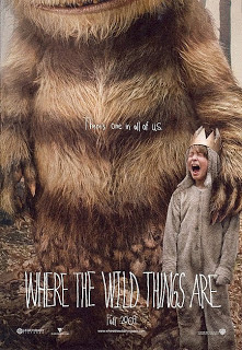
Where The Wild Thing Are
The most recent poster to be added to this list, Spike Jonze’s adaption of the popular children’s book doesn’t waste space showing viewers things they already know (like the complete appearance of the main monster). Instead, it focuses on capturing the quirky tone of the book and film. Throw in the knowing tagline `There’s one in all of us’ in a childish font and you have potentially my favourite poster of the year.
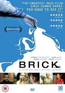
Brick
A fitting poster for one of my favourite movies EVER. The tagline is simple `A detective story’ and you can’t help but wonder how such a `detective’ story could revolve around the youthful and quirky characters pictured. The digital art keeps the poster hip while the dead-like hand points to something more sinister. Not to mention they also manage to throw in the quotes applauding the films brilliance and originality. My favourite Brick posters though don’t look at the film as a whole but instead focus on specific characters. There are five in total (one for each main character) and they’re combined with a witty summary of the character reminiscent of the films dialogue.

Humanoids From The Deep
So kitsch it hurts. I mean really, what is there to say about this poster except how brilliantly daggy it is? From the hand drawn artwork to the scenario the Humanoids From The Deep poster tells you everything to know about the movie. What the poster says is `You! Come along and see this movie where a bunch of wet, bikini wearing women will be chased by outlandish looking monsters’. Hell, with a poster this hilarious why wouldn’t you see this movie?

Red Sonja
Okay technically this movie hasn’t been released yet, in fact it won’t be out until at least 2010. But (and there’s a big but) the poster art for Red Sonja formed one of my first posts on this blog nearly a year ago and it’s easy to see why. For all the details on the movie and a step-by-step breakdown of the poster click on my previous post here. Overall, this poster is not only bold, bright and evocative, it also captures the she-devil essence of the title character perfectly. Now if it would just hurry up and be released already...

The Shining
Talk about iconic. The above image and following dialogue `Here’s Johnny’ have become one of the most recognised in film history. Massive kudos have to be given to the poster makers who were able to pick and display the perfect image from a scene which captures the madness and horror of Stanley Kubrick’s classic.

Lolita
Nothings says `jail bait’ like the above Lolita poster. The story about the forbidden relationship between an underage teenager and a middle-aged man was one of the most controversial films at the time and the poster did nothing but add to the is-it-promoting-pedophilia flame. The film is classic and deals with complex themes and I dig the poster because it manages to get all of this across in one shot. The poster combines the childlike nature of the title character Lolita while at the same time eluding to the sexual themes explored.